
A compliant bridge page is a short pre-lander that restates your ad promise, provides one clear call to action, and stays fully crawlable and functional for reviewers. That single rule matters because platform policy and conversion performance both depend on it: when the ad, the pre-lander, and the final offer tell the same story, reviewers have nothing to flag and buyers have no reason to bounce. This article covers the design principles, technical checklist, testing approach, and reusable templates we rely on for restricted-vertical campaigns.
TL;DR:
- Choose a short page for simple actions such as signups or installs, and a narrative advertorial for financial products or supplements.
- A technically broken page can be disapproved even when its claims are honest; verify crawler access, matching URLs, mobile rendering, clickable links, and certified tracking.
- Language or geographic variants can remain compliant when they show the same offer, but routing reviewers to different content can trigger suspension.
- Track completed offer conversions as the primary outcome, because a page with strong click through but weak final sales is failing its real test.
Table of Contents
- Design principles for a compliant, high-converting bridge page
- Should your bridge page be short or long?
- The technical checklist that keeps pages out of review trouble
- Where cloaking helps, and where it becomes a policy risk
- How to test bridge pages without tripping reviewer alarms
- Reusable bridge page templates and a reviewer checklist
- A practitioner’s note on risk, DIY, and when to call in help
- Getting managed help with ad approval and page setup
- FAQ
- Sources
Design principles for a compliant, high-converting bridge page
A bridge page works when it reads like the next honest step in the funnel, not a detour built to dodge a reviewer. The page should restate the ad’s headline and core benefit within the first few lines, then give the visitor exactly one visible call to action. Multiple competing buttons or a wall of claims make the page look evasive even when nothing on it is false.
Editorial clarity matters as much as layout. Avoid vague superlatives or medical-sounding promises that the final product can’t back up, since that mismatch is what draws manual review in the first place. Add real trust signals: a working contact link, a visible privacy policy and terms page, and a short “about” blurb that explains who is behind the offer.
- Mirror the ad’s exact headline and benefit in the first screen.
- Keep one primary CTA; remove secondary buttons that compete for attention.
- Link a real privacy policy, terms page, and contact method.
- Write claims a reviewer and a regulator would both accept at face value.
Pro Tip: Build your bridge page copy by editing down the ad copy, not by writing new claims from scratch, since any language that didn’t survive ad review has no business surviving page review either.
How long that page needs to be depends entirely on what you’re selling, which is the next decision to make.
Should your bridge page be short or long?
Offer complexity decides page length more than any design preference. A short bridge page works for simple, high-intent actions like an app install, a wallet signup, or a newsletter opt-in, where the visitor already understands what they’re getting. A long-form advertorial works better for trust-heavy offers like financial products or health supplements, where the reader needs context before they’ll hand over payment details.
- Simple action, low trust barrier: crypto wallet signup, free trial, lead form. Use a short bridge page: headline, one supporting image, two or three bullets, CTA.
- Regulated or trust-heavy offer: supplement sales, forex funding accounts, pharma products. Use a long-form advertorial: story lead, problem-to-solution narrative, social proof where permitted, then the CTA.
- Mixed signals: when you’re unsure, test both, but measure past the click. Long-form or short-form pre-lander testing consistently shows that the right length is the one that moves people through the full offer, not just through the page.
A pre-lander that generates strong click-through but weak final conversion is not working. Optimize for the sale, not the click.
The technical checklist that keeps pages out of review trouble
Most bridge page rejections are not about the copy at all. They’re caused by technical issues that make a page look broken or hidden to an automated crawler, even when a human visitor sees it fine. Google’s own destination requirements state that landing pages must be functional, useful, easy to navigate, and must match what the ad promised, and that non-crawlable pages or blocked navigation are common causes of disapproval.
- Make sure AdsBot and other crawlers can actually render the page, and that the displayed URL matches the ad’s final URL.
- Confirm mobile responsiveness and fast load times on a real device, not just a desktop preview.
- Remove intrusive interstitials, auto-downloads, or pop-ups that block the main content.
- Use certified click trackers only, and avoid redirect chains that obscure the real destination.
- Keep contact information, terms, and navigation links real and clickable, not decorative.
A page that fails any single technical check can trigger a disapproval even when the copy itself is fully honest, according to Google’s destination requirements, which treat technical function as part of the policy standard itself, not a separate concern. For pages serving device-sensitive traffic, our device cloaking guidance covers header-level checks worth running before launch.
Where cloaking helps, and where it becomes a policy risk
Cloaking and circumvention are specific terms with specific consequences. Google defines circumventing systems as showing reviewers different content than regular users see, and treats that mismatch as a serious violation that can lead to account suspension. Meta’s ad standards similarly require that ads clearly represent the product or service shown on the landing page, with deceptive mismatches triggering extra verification or disapproval.
The practical guardrail is semantic consistency: whatever a reviewer sees should carry the same product promise as what a real buyer sees.
- Safe uses: serving a language or geo variant of the same offer, or rotating between several reviewer-safe pages that all describe the identical product honestly.
- Unsafe uses: hiding a prohibited final product behind an unrelated front page, or routing reviewer traffic to a completely different offer than paying customers see.
Used this way, cloaking is an operational safety layer around a page that’s already honest, not a substitute for honesty. Our Facebook cloaking compliance guide breaks down how this plays out specifically on Meta’s review systems.
How to test bridge pages without tripping reviewer alarms
Testing a bridge page means tracking more than clicks. Pre-lander CTR tells you whether the page is engaging, but the metric that actually matters is end-to-end conversion: how many people who clicked the ad end up completing the final offer. A page that wins on CTR and loses on conversion is a page that’s misleading someone, even if unintentionally.
- Set your baseline metrics: ad approval time, pre-lander CTR, offer conversion rate, and end-to-end conversion as the primary number.
- Run controlled variations: change one structural element at a time (headline, image, CTA placement) and watch for reviewer flags alongside performance.
- Rotate safe pages: keep several compliant versions live, retire any that draw manual review quickly, and never leave a single page serving 100% of traffic for too long.
This approach protects account-level signals while still giving you real optimization data.
Reusable bridge page templates and a reviewer checklist
Two structures cover most restricted-vertical cases.

Short template: headline matching the ad, one supporting image, two to three benefit bullets, a single CTA button, and a visible contact link below the fold. Works for signups, installs, and other low-friction actions.
Long advertorial template: a story-style lead, a problem-to-solution narrative that mirrors how the reader actually found the offer, testimonials where the platform and vertical allow them, then the CTA. Works for supplements, financial products, and other trust-heavy purchases.
- Does the page restate the exact ad promise, word for word in spirit?
- Is the URL crawlable and does the display URL match the final destination?
- Are there zero dark patterns: no hidden costs, no fake urgency countdowns?
- Does it render cleanly and load fast on mobile?
- Are click trackers certified, with no obscured redirect chains?
Pro Tip: Keep a running library of both templates filled in for your current offers, so launching a new campaign is a copy edit, not a rebuild.
| Template | Best for | Core elements |
|---|---|---|
| Short bridge page | Signups, installs, low-friction offers | Headline, image, 2-3 bullets, one CTA |
| Long advertorial | Supplements, financial products, trust-heavy offers | Story lead, problem-solution narrative, testimonials, CTA |
Live examples of both formats, built for restricted categories, are available on our safe page examples page.
A practitioner’s note on risk, DIY, and when to call in help
The honest trade-off is this: a well-built bridge page buys you approval speed and account stability, but it still requires constant upkeep, rotation, and monitoring that most in-house teams underestimate until an account gets flagged. DIY works fine for a single low-risk offer. Once you’re running multiple restricted verticals at once, the operational load usually outweighs the savings.
— Umar
Getting managed help with ad approval and page setup
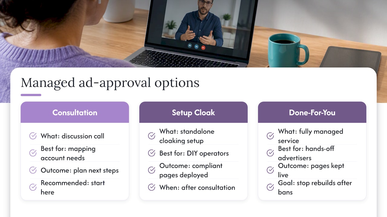
We built our services around exactly this problem: getting ads approved and kept live across major platforms for restricted verticals. Depending on what you need, we offer a consultation call to talk through your situation, a standalone setup cloaking system engagement, or a fully managed Done-For-You service. 
If you’re ready to stop rebuilding pages after every disapproval, start with a consultation and we’ll map out what your account actually needs.
FAQ
What is a bridge page in digital advertising?
A bridge page, also called a pre-lander, is a short page placed between an ad and the final offer that restates the ad’s promise and gives the visitor one clear next step. It’s used in restricted verticals to pre-qualify traffic and keep the ad-to-offer experience consistent for both buyers and reviewers.
How is a bridge page different from a landing page?
A landing page typically is the final offer page itself, where the purchase or signup happens, while a bridge page sits before it and exists to set expectations and filter traffic. In restricted verticals, the bridge page often carries the compliant, reviewer-safe messaging while the landing page handles the actual transaction.
Does using a bridge page count as cloaking?
A bridge page is not cloaking by itself. It becomes a circumvention issue under Google’s policy on circumventing systems only if it shows reviewers content that differs from what real users see for the same offer.
What happens if my bridge page fails Google’s destination requirements?
Pages that aren’t crawlable, load slowly, or block navigation commonly trigger disapprovals under Google’s destination requirements, even when the written content is accurate. Fixing the technical issue, not the copy, usually resolves it.
Can CloakingAd set up a compliant bridge page for my ads?
Yes, our setup cloaking system and Done-For-You services include building reviewer-safe pages for verticals like CBD, crypto, peptides, and supplements. Pricing is available through a consultation call or on our services page.
Sources
- Google Ads policies – Advertising Policies Help
- Introduction to the Advertising Standards | Transparency Center
- Long-form or short-form?